How To Use The New Facebook Photo Viewer As A Marketing Tool
The recent Facebook Page upgrades unveiled some of the most complex features we’ve seen on the platform yet. Navigating Facebook as your Page OR Profile; posting and commenting on other Pages as your Page; notifications of Page activity; News Feed just for Pages you’ve liked; weighted system for displaying the most popular posts on your Page wall; and, replacement of FBML with iFrames.
I will be publishing a series of posts diving deeper into specific Facebook features, along with an in-depth review of all the changes and their impact on marketers. This post covers two features I’m very excited about, as they have a distinct marketing advantage: the five-photo strip at the top of Pages (similar to Profiles) and the new Photo Viewer lightbox.
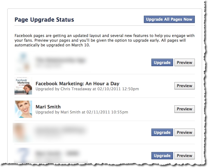
First, I strongly recommend that if you have not yet upgraded your Page, you need to dive in and do so right now! 🙂 All Pages will automatically be upgraded next month anyway. Go here to view all your Pages, check out the new layout with the Preview button first, then Upgrade.
New five-photo strip at the top of Pages
This new feature is identical to the new Profile design. Your five most recently uploaded Page photos are displayed at the top and will change any time you load new photos. Photos loaded by your fans and other Pages will not appear in this display. To remove a photo from the display, mouseover and click the “x”. Hidden photos will still be accessible.
What’s really cool is, just like your personal profile, you can get creative and use this valuable real estate for branding, special offers, tips, etc.
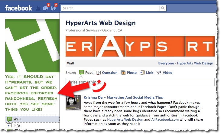
However, the photos do not stay in the same order (unlike Profiles). With each visit/refresh, the photos randomize. In the example above, Tim Ware at HyperArts Web Design mentions in the main Page image that they know the order is random. I refreshed Tim’s Page umpteen times and still couldn’t get the images to spell HyperArts. lol!
So, creating a sequential five-photo banner won’t quite work. (I’m not entirely sure why Facebook included the randomize feature. Perhaps so we can’t quite fully add a custom banner. Hm.)
Continue reading for my magical marketing tip, though!
New Photo Viewer Lightbox
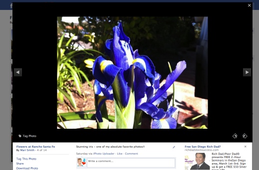
We saw a sneak peek of this lovely feature back in December. Each photo throughout the entire Facebook platform can now easily be viewed in a popup lightbox so you can see enlarged pictures, scroll back and forth, like/comment and never lose your place on Facebook. This is an extremely handy feature when viewing photos in the News Feed, on anyone’s Profile or Page, etc.
Magical marketing tip: put CTAs on your images to make them ads!
Now, here’s the magical marketing tip: create a series of photos with special offers and calls to action (CTAs) right on the images and you basically have your own five free Facebook ads!! 🙂 “Click here for details,” is an obvious CTA. Then, include a short narrative with a hyperlink to that offer in the photo description. When your fans click the image, up it pops in the nifty new lightbox where they then see the description and link.
Any images of links (URLs) will, of course, not actually click through to the web page. BUT, when anyone clicks on the five images at the top of your Page (or anytime you share an image on your wall, load to an album, etc), they see the image pop up in the lightbox where you then have your compelling offer.
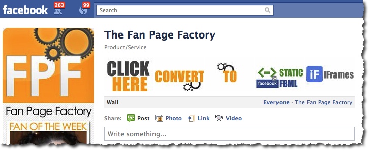
The ideal dimensions to make sure the thumbnail size shows properly is: 970px by 680px. Facebook then makes the entire image the thumbnail size, which is 97px by 68px. In the Fan Page Factory screenshot above, my buddy Nathan doesn’t have CTAs on each image, but he does have a compelling offer under each photo. Props to Nathan for the tip on the dimensions-to-thumbnail ratio! Quote:
If the ratio is not (1.426=97/68) Facebook will NOT render the entire photo as the thumbnail and will rather recenter the thumbnail and only show “out” until the ratio is met.
I recommend that you create at least five images like this, each with special offers and clear, “CLICK HERE” type of CTAs. Periodically change the images and offers. Each time you post a photo (photos tend to get the highest EdgeRank in the News Feed), your post goes out into the feed of fans and other pages that have liked you.
You might also check out the photo template made by ShortStack Labs.
550 new subscribers in less than 24 hours!
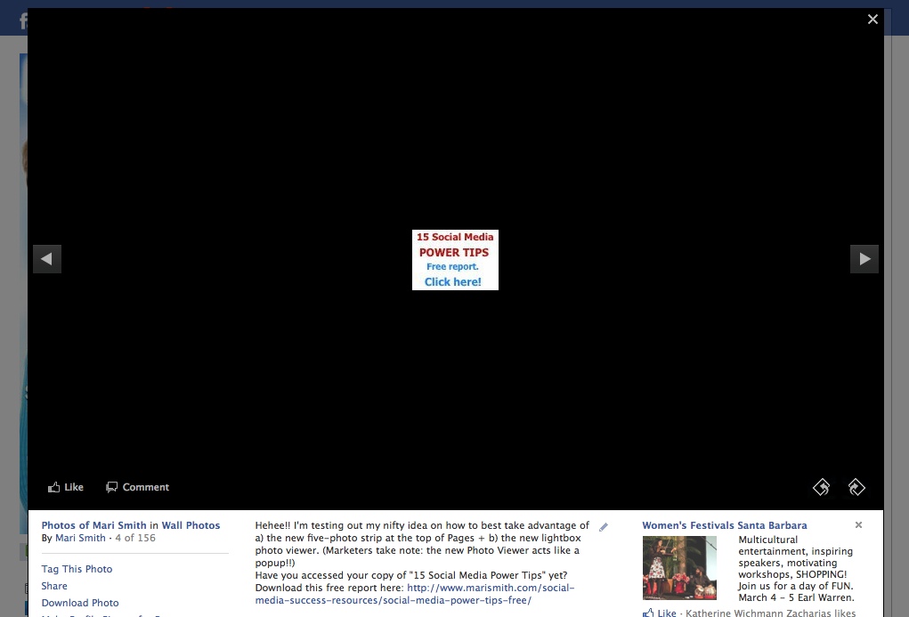
I tried the image-with-CTA experiment last Friday and uploaded a real simple 97px by 68px image (size of the thumbnail – I didn’t know at the time to make it 10x!). Within 24 hours, I had over 550 new opt-ins for my 15 Social Media Power Tips! I saw many fans shared the same photo on their page/profiles. Which, of course, creates a viral effect for the offer!
Though the image looks teeny in the Photo Viewer, it’s the proper size for the photo strip at the top of my Page. But, clearly, size didn’t matter!
Initially, I put the CTA in the narrative first followed by an explanation of my experiment. But, I edited the narrative so my usual, bubbly style showed first. I didn’t want it to suddenly come across as pushy/salesy in the News Feed of my fans. It’s important to remember whatever narrative you add to the photo will be what shows up in the News Feed of your fans.
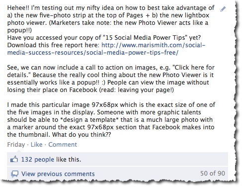
Here’s the next offer I’m sharing via Facebook Photos:
Would you like to spend 2.5 days with me – either LIVE in person in sunny San Diego, or VIRTUALLY via streaming video access – and begin to master Facebook marketing? April 1-2, optional Beginners Bootamp on March 31. Check out my fab new page for this event, just unveiled today! http://weekendwithmari.com. If you’d like to attend live, save $500 on the 1 or 2 ticket price! Just enter ‘500discount’ on the check out page.

Social Media Mastery Immersion – Join Mari Smith!
So, what do you think? Will you use your five-photo strip strategically for images with offers and calls-to-action? I’d love to see some creative examples – feel free to share in the comments below and include a link back to your Facebook Page!

@pixellaynegraphixs
Thanks for this tut! Now I need more fans!
Keep up the great work!
Athena
I tried using 970×680 in the 5-strip photo area, but FB is still cropping them – I had to upload 97×68 photos, but of course when you click on them they are tiny in the gallery. Am I missing something?
What great ideas Mari! Just wanted to stop by and say thank you!
Excellent tips!! Thanks for sharing. I’m off to make some changes…
How fun to stumble across your post right after doing this on my page! Great minds think a like?! Wowee. I didn’t resize my images, just uploaded my eCovers, etc. with a CTA in the description. I wonder how I could track the effectiveness… ?
Hi Mari,
I’ve started to create a ‘Fruit Machine’ (well it randomizes every time!)
http://facebook.com/officialjon
Thanks Mari. I had a similar idea to utilize the space, but as usual you elevated my thinking on this considerably!
BTW – I’ll just come out and say it – Facebook Marketing – An Hour A Day co-Authored by Mari is a great read.
Hey Mari, great post and thanks! So, it appears it doesnt matter which album a photo is loaded into on Fan page, as far as what shows up on photo stream. Or, maybe you are still working on that! thanks for any insight.
Shelley
You are awesome, Mari! Thanks for always having such fabulous suggestions. HUGS!
Mari, this is absolutely genious! I have the perfect application for this coming up soon: I can advertise a giveaway for one of my handmade party banners that will be on another company’s blog.