Facebook Timeline for Business Pages – 21 Key Points To Know
If you have not yet converted your Facebook fan page over to the new Timeline design, your page will automatically convert on March 30th, 2012 which is coming up fast. This post covers the majority of basic settings and features you need to know. Even if you’ve upgraded, you’ll find some tips here!
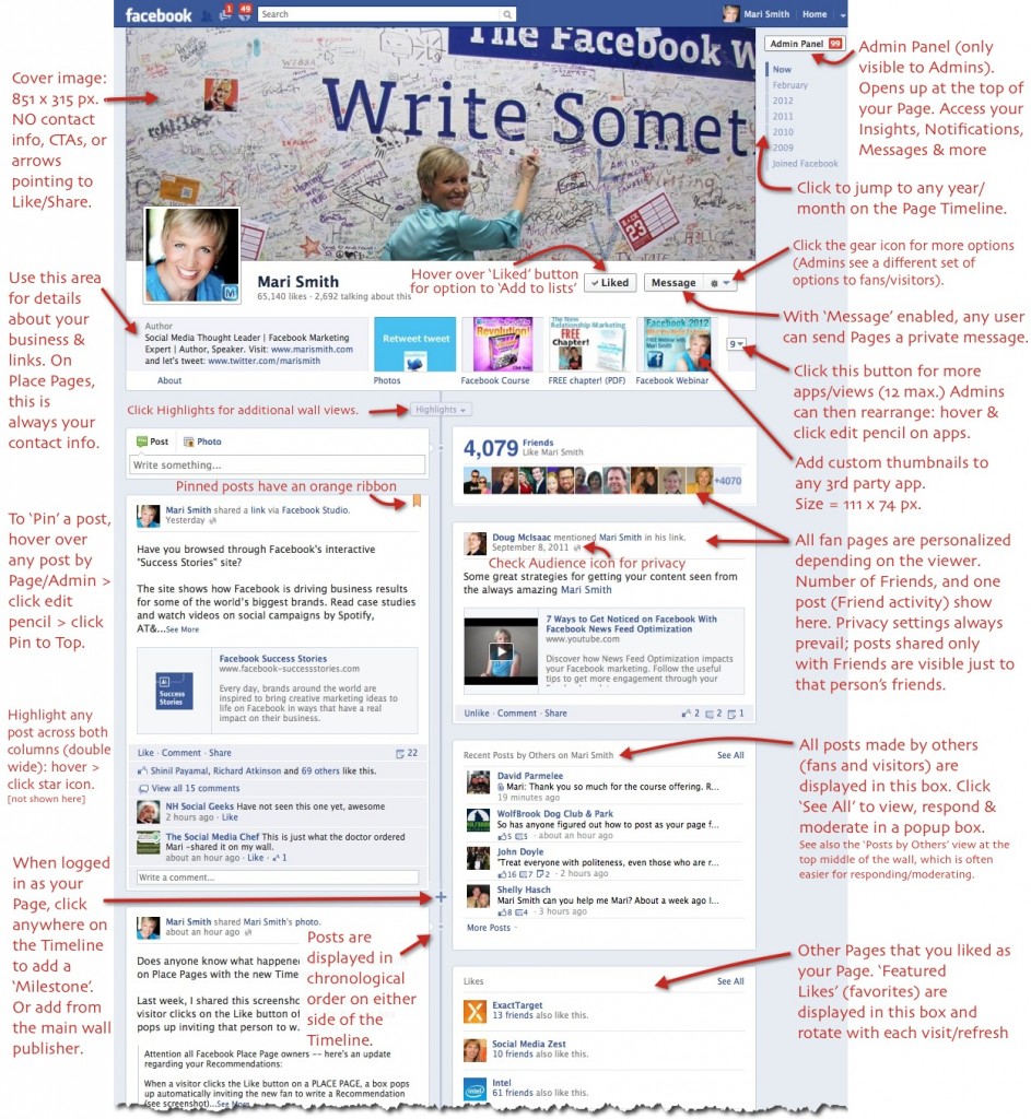
First, review this marked up screenshot for a tour of most of the features — click the image to view full size (you may need to click again on the image on the next page):
Cover image replaces default landing tab
One of the biggest feature changes that many businesses are upset about is the removal of a default landing tab. That is, where you can create a custom landing page for non-fans using an iFrame app, and add rich media, an opt-in box and/or a compelling reason to join your fan page. In addition, many businesses made use of the “like-gating” or “fan-gating” feature on these default custom landing tabs where you could entice your fans to click the Like button and then reward them with a special benefit such as a coupon code, or unique content just for fans.
The good news is you can still have custom tabs, plus the like-gating element still functions. You just can’t set a default landing tab. However, each of your apps still has its own unique URL. That means you can drive traffic to any “landing” page you wish – from within Facebook via ads, your profile and other places as appropriate; and from outside Facebook on your website/blog, other social profiles, tweets, email campaigns, email signature files, and so forth.
With the new Timeline design, you’ll notice the generously large cover image at the top of your page. You may find that you care less and less about a default landing tab with this piece of prime real estate that is always visible to fans and non-fans as they land on your page. The dimensions are 851 pixels wide by 315 pixels high. It’s a wonderful place to showcase photographs and graphics pertaining to your brand/business. Personally, I’m very excited about the cover image! The possibilities are endless… even with the tight rules around what content cannot be placed on cover images (see key point #4 below).
21 Key Points To Know About Timeline for Pages
To keep you on track with the change, here’s a list of 21 key points about the new Timeline design:
1. Preview
You have a chance to preview your page(s) first, made all the edits you wish, get it just the way you want it, then publish. Look for the preview option at the top of your page in the old design. Or, see a list of your pages here and turn on page preview mode. Before you publish, at minimum just have an attractive cover image loaded.
2. March 30
Your page will automatically convert on March 30. My advise is don’t wait. There really is no strategic advantage to waiting … okay, maybe if you have a really hot custom landing tab with a like-gating campaign that’s going extremely well. Otherwise, go for the upgrade now and lead the way by educating your fans on all the new features.
3. Cover Image
Dimensions for the large cover image is 851 x 315 pixels. If you upload an image that’s smaller than these dimensions, it will get stretched to this larger size. The image you upload must be at least 399 pixels wide. Facebook encourages you to change your cover image as often as you wish. Newsflash: each time you change your cover image, this posts on to your wall and goes out into the news feed of your fans. You may find the activity itself doesn’t get great Edgerank (visibility score in the news feed). So, what you can do is hide the activity on your wall, then share the new cover image with a call to action in the textual area, e.g. We’re celebrating 10,000 fans today and just changed our cover image in honor of all of You! Click like if you like! 🙂 (To be clear, that message does *not* go ON your cover image itself. You’re posting your cover image on your wall with the message as a description.)
4. Image rules
Do not put contact info, calls to action, or arrows pointing to the Like or Share button on your cover image. See the Page Guidelines here. Contact info should go in your about section. The no calls to action rule is likely because Facebook has been very generous with this large piece of real estate … however, the company does not want us to run hogwild with all manner of promotions and campaigns… for free! Those come at a price and are called Facebook ads! And the new Premium Ads and Reach Generator. And, the one I’m most excited about: Offers (that one is actually free to set up, though currently only available to large brands).
5. Profile picture
Your profile picture is always a square and is displayed at 125 x 125 pixels or 150 x 150 pixels, depending on the size of someone’s screen. The photo you upload must be at least 180 x 180 pixels. Facebook discourage page owners from changing their profile picture that often. This is the primary, instantly-recognizable image that tracks you throughout Facebook wherever your posts go and wherever you comment as your Page.
6. Landing tab
You can no longer set a default landing tab. Make good use of the cover image, instead (see #3 above) and the three main apps (see #8 below). Plus, drive traffic to whichever tab you wish (see #7 below).
7. App URLs
Custom apps all still function, including the fan-gating feature. Each tab/app still has a unique URL so you can drive traffic from inside or outside Facebook to any ‘landing page’ you wish.
8. Showcase apps
Just below your cover image, your ‘tabs’ are now displayed as apps or views. You can have a max of 12, though only four are always on display. The first one is always Photos and cannot be moved. ‘Views’ are Facebook’s default apps or features such as Photos, Events, Likes, Notes, Map. Apps are all third party apps.
9. Custom thumbnail
You can add a custom thumbnail image to all your apps. The dimensions are 111 x 74 pixels. These are great areas to get creative and add seamless branding, calls to action, and specials. To add/change a custom thumbnail, first expand all apps by clicking the small down arrow to the right of the four app display. Then hover over any app > click the edit pencil > click Edit Settings > click Change next to Custom Tab Image (opens in a new window) > click Change > upload an image. Voila. The image loads and saves right away. (I have noticed bugs with this feature and have often seen other pages’ thumbnails appear… you may need to upload a couple times to get your image to stick!).
My Irish and Scottish friends across the pond have done a super job of their Timeline branding on Social Stars – the image below shows their creative use of the custom app thumbnails. But do check out their cover image, too. It’s one of my favorites!
10. Liked button
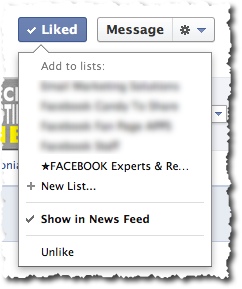
The like button now tuns to “liked” when clicked. Users can HOVER for options, including adding to an Interest List(s). The Liked button is a great new feature as it visually informs fans that they have already liked the page. However, the hover feature and ability to add pages to Interest Lists is very new and really not obvious at all. (See #11 and my next blog post!)
11. Interest Lists
Encourage your fans and visitors to add you to an Interest List; let them know which topic is best, e.g. my Page would be best added to a list called Facebook Tips, or Facebook Marketing, or Social Media Marketing. (Interest Lists are brand new as of March 8th. More on the new Interest Lists in an upcoming post! Speaking of lists, please do subscribe to my popular Facebook Experts and Resources list, with 77 people and pages and currently over 800 subscribers.
Got Facebook questions? Come join my community of over 260,000 fans and subscribers! Just click the Subscribe and Like buttons below to connect with me on Facebook!
12. Milestones
You can go back in time to add business milestones on your Timeline. When you do, these will post at the right date, and go out into the news feed of your fans and create more visibility and engagement. The full extent of the actual timeline element of the Timeline design is geared toward what Facebook calls “Legacy Brands” – those brands with historical data spanning decades that they’d like to feature.
13. Wall Filters
Page walls now have four filters: Highlights, Posts by Page, Posts by Others, and Friend Activity. There is no way to set the wall to be posts by everyone. The default is always Highlights. In your page settings (Admin Panel > Manage > Edit Page > Manage Permissions), you can choose to not let anyone write on your wall, or to not display Posts by others. However, I recommend that you leave the settings on to allow everyone to write on your wall, everyone can add photos and videos, and show the box for Recent Posts by Others.
14. Pin posts
Any post made by the Page can be pinned the top of the wall for up to 7 days. I suggest rotating which posts are pinned and not letting any post sit there for longer than 1-2 days. You never know how many repeat visitors are coming to your Page and you want to keep it fresh for them.
Enjoying this post? Tweet to let me know – just click the button below (opens in a popup, you’ll have a chance to see and edit the tweet!):
Tweet to @MariSmith
15. Highlight posts
Page admins can choose to display any post made by the Page or by others as ‘double wide’ – meaning the post spreads across both columns of the Timeline. Hover over a post and click the star icon to highlight.
16. Posts by others
Posts made by others (fans and non-fans) are in a small box at the top right called Recent Posts by Others. You can scroll in this field without leaving your wall: first click ‘More Posts’ on the lower left of the box and use your mousewheel or the vertical scroll bar. Or click ‘See All’ for a popup box. For viewing and moderating, it’s easier to view these posts on the Posts by Others wall filter, though, as mentioned in #13 above.
17. Default wall
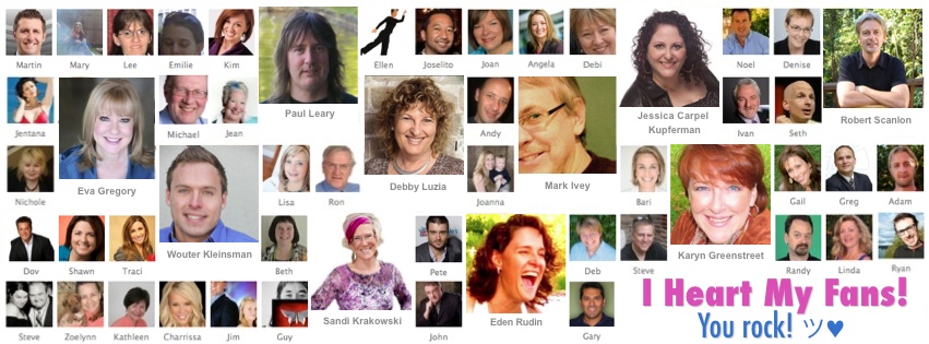
You cannot set a default wall view – it’s always Highlights. I’m seeing a few disappointed page owners talk about this. I tend to agree – the new Timeline for Pages design seems to really favor brands and businesses showcasing themselves vs. making it community-focused. However, with creative use of your cover image and changing it regularly, I believe you can build a wonderful culture of mutual respect between you and your fans. (I’m working on a strategy just now to change up my fan page cover image every 1-3 days; I’m experimenting with montages of featured fans which has been received very well by my Facebook community).
18. Personalization
Page Timelines are personalized for each person viewing: every page wall includes ‘friend activity’ at the top right where the person viewing will see one post from the past from a friend (or a Facebook user to whom the viewer has subscribed). Frankly, I think this is a complete waste of valuable real estate and I’m already tiring of seeing old (no-longer-relevant) posts repeatedly dredged up when viewing my own page and/or other pages while logged in as my profile. I hope, on the next feature overhaul, that Facebook removes this section and replaces with something more valuable – or enlarges the Posts by others area! That’s my $0.02!
In addition to the one post displayed at the top right of the wall, any Admin or visitor to your page can view your Timeline wall via the ‘Friend Activity’ filter mentioned in #13 above.
19. Adjust photos
You can now reposition photos shared by you or others on your page: hover and click the edit pencil, then click Reposition photo, then drag the image where you want it, and click Save.
20. Messages
Fans and visitors can now private Message fan admins – you can turn this feature off in your settings but it might be a good idea to leave it on to encourage connection from prospects! You cannot initiate messages as your page; you can only communicate via Messages when someone contacts you first. The one drawback of yet another method of communication is that you may need to add more community managers to deal with the increase in emails. You’d be surprised at how many people start to contact you via your page!
21. Admin Panel
It takes several more clicks to get to the various settings of your Page now. You may have to dig deep to find features that were once just one click away. For example, to view your Hidden Posts (posts flagged as spam by Facebook that are only visible to Page Admins, to the person/page who made the post, and to friends of that person) – previously it was ONE click on the Hidden Posts link under your Wall on the left. Now, it’s FIVE clicks to get to the same place! Click Admin Panel > Manage > Use Activity Log > All (upper right menu) > Spam. From there, hover over the spam icon to the right of any post that is not spam, and click Unmark as Spam.
So, those are 21 key points I’ve compiled. I’m sure there are many more to add – stay tuned for additional posts on the subject of the new Timeline for both Pages and personal Profiles. Meantime, here are even more tips and resources to help you on this journey of mastering the latest round of Facebook changes. (I hope your seatbelt is fastened; it’s been non-stop at Facebook HQ for some time now what with the IPO.)
Customize Your Facebook Page – video tutorial
If you’re brand new to the Timeline design for Pages, this handy video by the Facebook team is well worth the 3.5 minute watch:
Facebook’s Page Guidelines and New Timeline Page Tutorial
Unlike many of Facebook’s past product launches and feature upgrades, the company has outdone itself this time with the comprehensive range of guidance for the Timeline design for pages. The following resources are all from Facebook:
- Plus, for even more guidance, go to www.LearnFacebookPages.com for an interactive course – this is brought to you by Facebook and is very well done! You may need to temporarily disable popup blockers for the course to start.
- View more Facebook video guides here.
- Read the revised Page Guidelines here.
- Download Facebook’s PDF Pages Overview here.
- Want to read up on how other businesses are creating success with Facebook’s variety of products? Check out this nifty, interactive resource – Facebook Success Stories.
Recommended reading:
- Facebook Timeline for Pages – Frequently Asked Questions [hyperarts.com]
- 28 Things You Need To Know About The New Facebook Pages [by Kristi Hines on kissmetrics.com]
- 15 Creative Tips to Rock Your Timeline Cover Photo for Facebook Pages [wchingya.com]
You made it down here! Good news – when you convert your page to the new Timeline design, you won’t lose anything. Well, that is, unless you’re a local business with a Place Page, in which case you will lose your Recommendations, for now. I understand they are coming back in the next week or two. Last week I did see that anyone could still write a Recommendation for your business and post to their personal profile to share with their friends – the popup shows upon clicking the Like button. However, I’m not seeing that popup option any more. Plus, the new Timeline design of Place Pages currently has nowhere to display these Recommendations. At least not that I could find. So, it seems Facebook is working on this feature.
Phew, so there you have it!! This turned into a monster blog post, even though I kept saving more in-depth discussion for SO many of these new features – and new optimization strategies – for future posts. Let me know if you found this helpful in the comments below. Is there anything missing? Where are you feeling most stuck?
Facebook 2012 Fan Page Checklist
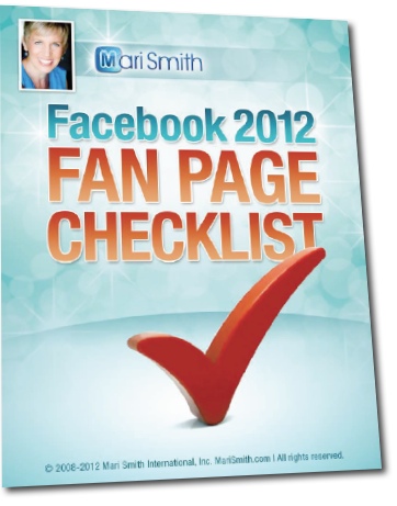
To download my 14-page Facebook 2012 Fan Page Checklist, just pop your name and email below and I’ll give you instant access to this popular document (over 17,900 downloads!). The checklist part is the first five pages; the rest is all endnotes explaining the elements of your page and how best to set up and optimize for marketing and engagement.
This version is hot off the presses, and includes all the latest Facebook Timeline features.


Thanks for the great post Mari
Thanks for your positive attitude and pointing out the good. Its been a tough change for me. I have a question. Is there a way to invite your friends like you used to.. I know that there is a place that you can invite via email, and it shows like gmail and all those other things, but not my friends list so I can Just send them a facebook invite. Id love to know if anyone knows how to do this
Thanks so much Mari, awesome post. Is it possible to change a Community Page a client set up for their business to a proper Fan Page or will they have to start again?
I’m getting an error message when I try to “subscribe” to your interest list (#11 supra). Is it me, or Facebook, or the link? when I click on it, the message I get is “Unable to Subscribe: We were unable to create this subscription.” on a Facebook page. Help?
Excellent checklist. Thanks, Mari. You are a social media rock star!
Aww thank you kindly!!
Hi Mari, Great info here . Facebook just keeps rolling along like the river. Twists and turns and changes by the season. Glad we have you for our pilot to keep us in the channel and on course. Bought your book the new relationship marketing when it first came out. Can’t tell you how helpful that has been and really helped me from making potentially horrible mistakes.
To your success…
So kind of you to say, Tom! You rock. hehee yeppers, Facebook is one giant big non-stop river! 🙂
Hi Mari, Great info here . Facebook just keeps rolling along like the river. Twists and turns and changes by the season. Glad we have you for our pilot to keep us in the channel and on course. Bought your book the new relationship marketing when it first came out. Can’t tell you how helpful that has been and really helped me from making potentially horrible mistakes.
To your success…
What a fantastic summary, thanks Mari. The graphic is a great, concise way to explain all the changes.
We have updated our simple guide that we put together with a link to your summary: http://corp.wishpond.com/a-simple-list-of-dos-and-donts-for-your-new-facebook-timeline-brand-page/
AWESOME – thank you so much!!
Helpful information. Thanks for sharing ………
”
It takes several more clicks to get to the various settings of your Page now. You may have to dig deep to find features that were once just one click away. ” And to think facebook wants companies to ‘advertise more’ – all I can say is no way facebook, not until you fix this bottleneck!
This is the absolute worst thing facebook could have done. How difficult would it have been to include “Use facebook as (My Page Name)” by clicking on Admin Panel??? With merely 3 pages to manage right now this means the Admin Panels are open all the time. What happens when we roll out our other 40 pages?
YIKES – that is a big headache for sure. There really ought to be a nice clean dashboard for multi-page management!!!