Facebook Groups Get A New Design — With Cover Image
The din of excitement about Facebook Timeline for Pages might be drowning out any news about a new look for Facebook Groups! InsideFacebook.com first announced this change on February 2nd, showing this group with the new design. But, I didn’t see or hear much more about it. Until now!
It seems Facebook has been testing this feature for the past couple of weeks. And now, all Groups just got the new upgrade!
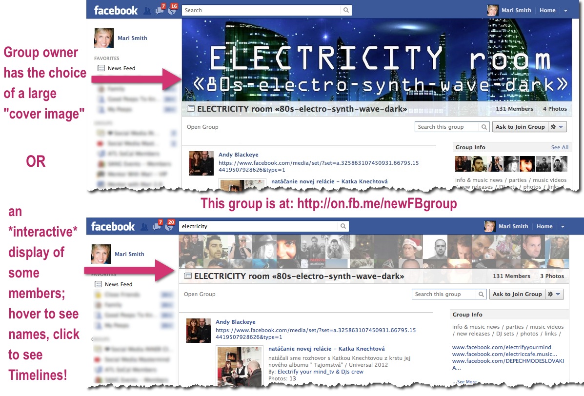
One of my Facebook fans from Slovakia posted on my wall that his group had the new design on February 16th. See screenshot below – click to view full size:
Member Photo Montage
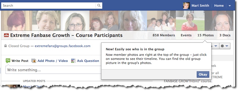
The default view for the top of Groups is a showcase of members with a nifty interactive photo strip. The member images are transparent but when you hover over the photo strip, full color is restored and you can see the members’ names as you hover over individual photos. Click on any photo to go to that person’s Timeline. (Note that doing so opens in the same window; to open in a new window/tab, right click on any member photo first).
The most recently active members are randomly displayed each time you visit your Groups. Members of my largest and most active group (860+ members), tested this out a fair bit and it’s clear that the most recently active members get “first dibs” on the photo strip.
From the screenshot above for the Electricity Room’s Group (taken last week), the photo montage is two rows of 16 photos. However, it seems now the default is a single row with 8 images, as shown below:
I suspect Facebook ran some tests with the 32 images and opted for 8 instead. Perhaps faster load time?
Now, given the fact Facebook clearly has the technology to create this cool header with a montage of members that is fully interactive, I’m wondering if this could be a preview of coming attractions in other areas of Facebook? Like Events? Fan Pages?
Hmm! HOW EXCITING!! Listen up fan page owners: could you imagine the power of having a dynamic display of your fans at the top of your page? Your fans would keep coming back to ensure their face/avatar was displayed at the top. Of course, I would like to see the option to have both a branded banner (narrow is fine!) and a dynamic display of fans.
Large Cover Image!
Guess what? Just like personal Timelines, Group admins can now select from a large “cover” image instead of the member photo montage.
The cover image dimensions are 802 pixels wide by 200 pixels high UPDATE: as of March 30, the new banner dimensions are 801 x 250 px (slightly smaller than the personal and page Timeline cover images which are 851 x 315). However, note that the Group cover image tucks behind the group’s opaque “info bar,” so I recommend leaving a strip at the bottom 30 pixels high without any writing.
There is one oddity to be aware of: in some groups, members can upload their own cover image which displaces the current one or replaces the member photo montage. I’m certain this is simply a bug with some groups, vs. a feature setting. I hunted high and low for such a setting, but it doesn’t exist. I’ll keep you posted on what my members and I discover.
Meantime, do you have this new group layout on your Facebook groups yet? Do you like it? Have you chosen to go with a banner or leave the dynamic member photo strip in place?
And, with the upcoming announcement of Timeline for Pages, what features do you hope to see? Let me know in the comments below!
Send me a tweet now to let me know you read this post! Click the button below
Subscribe to my Timeline public updates here:
Want to boost your Facebook marketing? Come join me and more than 1,300 business owners, professionals, and fellow marketers from around the world on this groundbreaking new 8-part Facebook training course, EXTREME FANBASE GROWTH™: 21 Insanely Effective Ways To Expand Your Facebook Impact. All modules are recorded; the course launched this week but you can quickly catch up! We also have a very active Facebook peer-support group too – awesome for networking.


Thank you! Useful information
nice
This site is very great and indispensable to my thank you to expect continued success with the authorities there are millions of people come easy memlunkalan but I guess I did not bring the language
????? ????
?????
??????
I find the Large Cover Image for groups annoying. Is there any way to make it disappear?